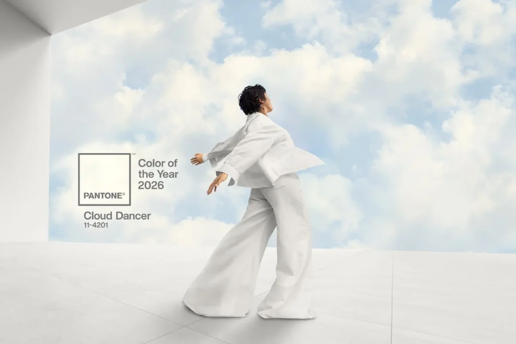
The leading color authorities Pantone and Sherwin-Williams have announced the colors of the year for 2026. Pantone presented the soft off-white shade Cloud Dancer, described as a symbol of clarity, simplicity and an inner sense of calm. More information about this concept is available on the official Pantone Color of the Year page and in an analytical article published by CNN.
Sherwin-Williams introduced the warm neutral tone Universal Khaki, associated with stability, comfort and a grounded, tactile presence. The official description is available on the Sherwin-Williams website.
These announcements shape more than a seasonal palette. They also influence the visual language that will appear in clothing, accessories and interiors. For those who work with leather and hand stitching this is also a moment to look at familiar materials through a new lens.
Pantone and the reality of the workshop
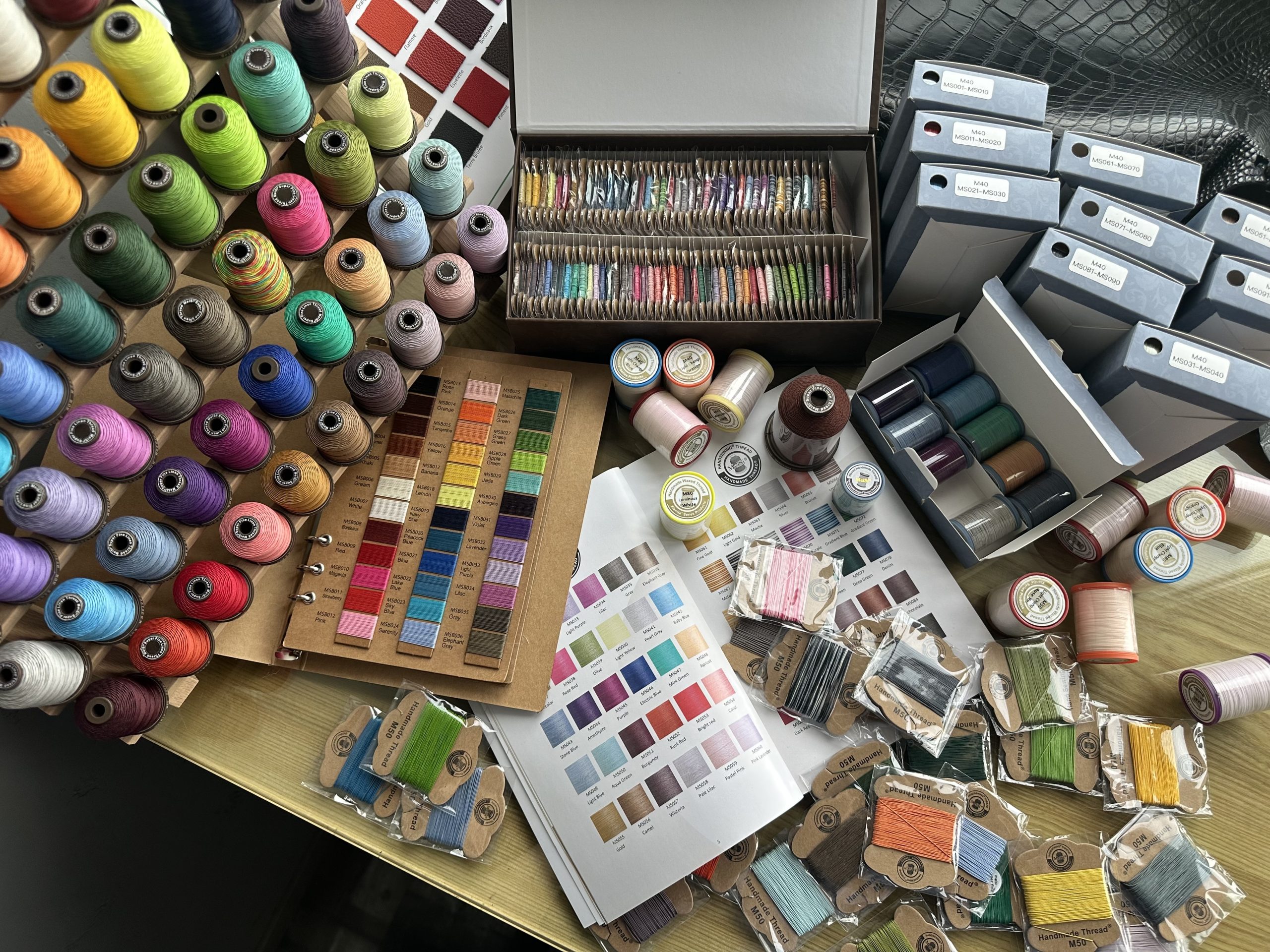
Pantone operates with millions of digital shades and precise codes. The palette of thread is different. It is limited by practical requirements such as dyeing technology, color stability, resistance to wear and resistance to dirt.
Even a large manufacturer such as Meisi offers not an infinite catalog but a carefully selected range of colors designed for real work in the workshop. The goal of a craftsman is never to “match the Pantone code”. It is more important to understand the mood of the color and translate it into an object through leather, texture and stitching. Cloud Dancer carries a feeling of lightness and clarity. Universal Khaki carries a sense of natural warmth and grounding. These ideas are more important than the exact digital code.
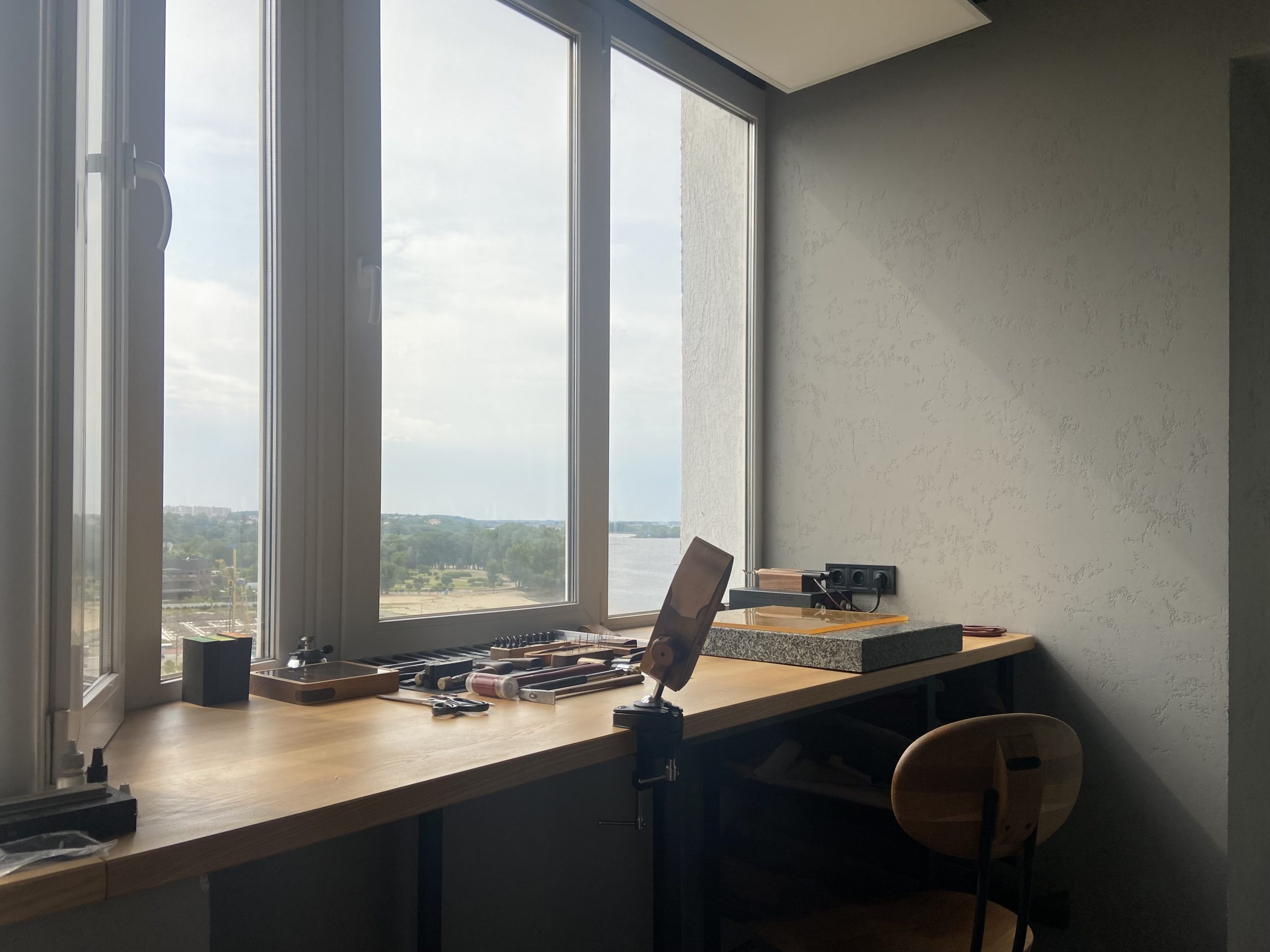
I often write about my personal approach to the choice of materials and color harmony in other articles in this blog, where I explain how I combine leather, thread and hardware in the context of long lasting items.
When thread becomes a part of a brand identity
In the history of many brands thread is no longer a simple functional material. It has become a visual signature.
A classic Breitling leather strap is difficult to imagine without contrast stitching in natural or white tones. These bold stitches create a recognizable sporty and refined character. Examples of this style can be seen on the official Breitling website.
Longines also uses light stitching on leather straps. This detail creates a subtle but clear accent that connects the strap with the dial markers and hands. The visual rhythm becomes more structured. Examples are available on the Longines website.
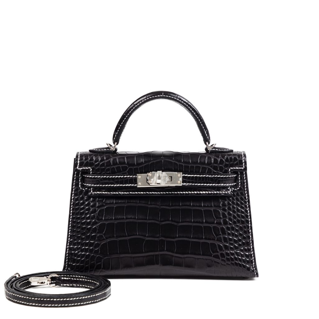
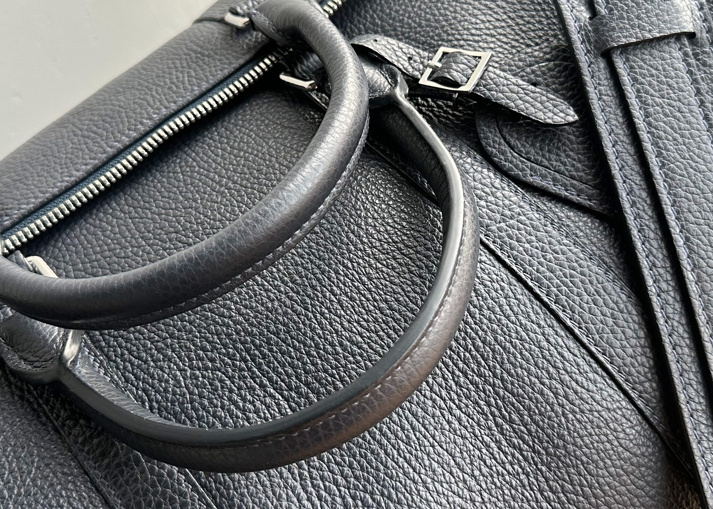
Hermès uses contrast saddle stitching in many of its leather goods. A light or off-white thread highlights the geometry of the bag and points to the equestrian origins of the house. Every stitch reminds the viewer of craftsmanship and heritage. This approach can be seen in the leather section of the Hermès website.
In all these examples the thread is not secondary. It supports the design idea and becomes a part of the brand language. The thickness of the thread, the length of the stitch and the level of contrast all influence the character of the item.
Several pieces in my own portfolio also rely on light contrast stitching. In the Bespoke Objects section of my website I show watch straps and accessories where a clean, bright stitch visually defines the shape of the object.
Cloud Dancer and Universal Khaki translated into stitching
Cloud Dancer and Universal Khaki can be understood not as exact shades but as different states of mind that a craftsman can express through stitching.
Cloud Dancer is not an ideal code of off white. It is the idea of a clean and soft line on the surface of deep or textured leather. A light thread can draw the contour of a strap or a bag. It can highlight proportions and create a rhythm.
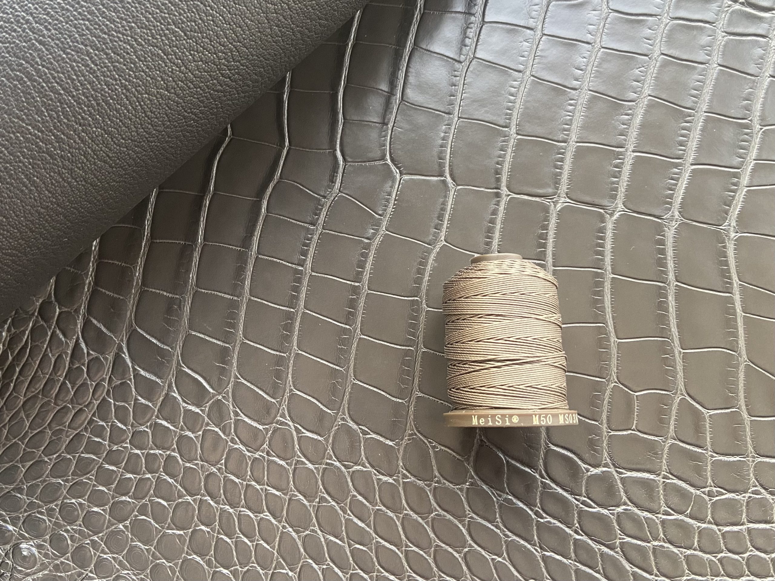
Universal Khaki is not one specific beige. It is a natural and tactile feeling. It relates to warm earthy tones, sun-worn materials and the calm presence of natural fibers. In the language of stitching this is a family of warm natural threads that support the item gently and quietly and never depend on seasonal trends.
In real workshop practice the choice of thread is always a balance between trend and longevity. Straps, bags and accessories live for many years. A stitch must survive this time physically and visually. Light and natural stitching remains relevant regardless of how the color of the year changes.
A view from a leather crafter and MeiSi ambassador
As a leather crafter and MeiSi ambassador in Europe I never see the palette of thread as an attempt to mirror Pantone in scale. I see it as an intentional and thoughtful selection of colors that
• behave well on leather in daily use
• support contrast and subtle accents
• remain relevant beyond a single season
The colors of the year can inspire us, but they never dictate the craft. They invite us to think more deeply about how we use the stitch line and how we choose thread for contrast and visual balance. The craftsman decides whether the thread is a discreet supporting detail or a quiet but expressive accent.
The trends of 2026 bring attention back to clarity, calm and natural tones. For me this is an invitation to look again at my familiar light and natural threads and see them not only as materials but as tools for shaping light, form and character.
More examples of these ideas can be found in the Bespoke Objects section of my website where I present hand stitched items and the stories behind them.